This was my first experience conducting a UX research project. I performed a comprehensive usability evaluation of Svinando.com, an Italian e-commerce platform specializing in wine sales.
Evaluation Methods
1. Heuristic Evaluation
I began by conducting a detailed heuristic evaluation focusing on three key pages: Login, Home, and the seasonal Christmas page. This evaluation revealed several usability challenges:
The login page presented issues with its registration form - particularly around password requirements visibility and post-registration guidance. The homepage had system visibility problems, with users struggling to determine their location within the site structure. The Christmas promotional page, while seasonal, shared similar navigation and consistency issues with other sections of the site.

2. Cognitive Walkthrough
My analysis focused on two fundamental user tasks: purchasing a Piedmontese red wine and completing the registration process. This methodical approach helped identify specific friction points in the user journey.

3. User Testing
I conducted usability tests with six representative users from diverse age groups and technical backgrounds. Testing took place in users’ natural environments using mobile equipment to reflect everyday usage patterns.
The testing revealed several key insights:
- Registration generated the most errors but was generally completable
- Wine purchase tasks took the longest time, with users struggling to locate regional categories
- Blog access proved challenging due to poor placement in the site architecture


Sample Solutions for Selected Issues
Based on our findings, here are some proposed solutions for a few of the identified problems. These represent just a subset of the issues discovered during our evaluation:
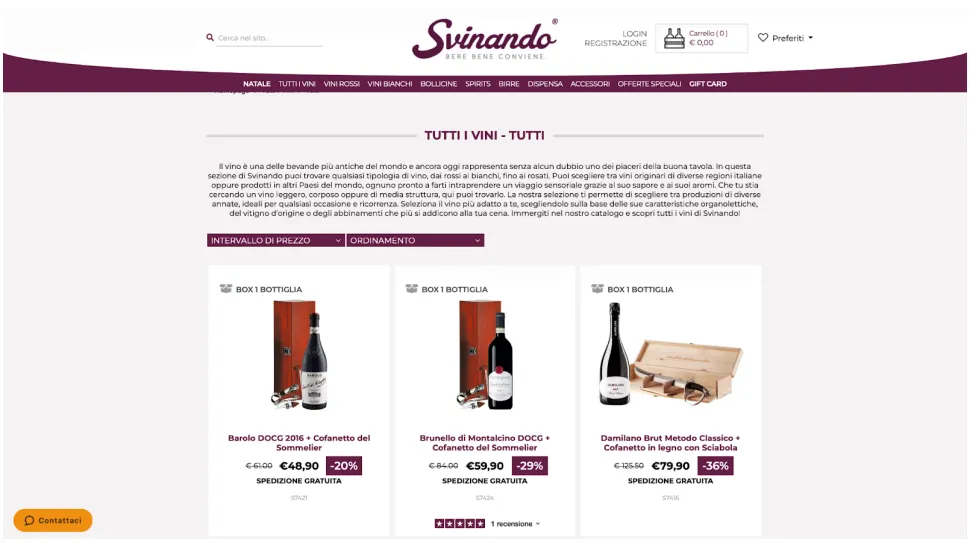
Homepage Visibility in Navigation
A possible solution to improve the homepage accessibility in the main menu:

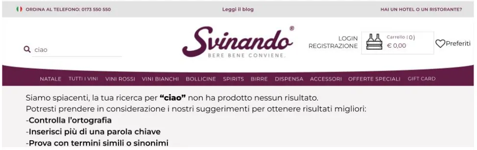
Search Result Improvements
A proposal for handling unsuccessful searches:
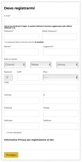
Registration Form Enhancement
A solution addressing the password requirements visibility issue:
Learning Outcomes
This project served as an introduction to UX research methodologies. Through the evaluation process, I gained experience in:
- Conducting systematic usability evaluations
- Implementing various testing methodologies
- Understanding user needs and behaviors
- Proposing targeted solutions for specific usability issues
As my first UX project, this experience taught me the importance of systematic evaluation and user-centered design. It also highlighted how small, thoughtful changes can significantly impact overall user satisfaction and site usability.